The Future That Never Was
Concept cars have been pretty boring in recent years. There are occasionally some interesting stylistic exercises, or some showcases of new technology, but for the most part, recent concept cars have been pretty dull. It wasn’t always that way, though. There was a time when concept cars were…insane.
Part of the problem with modern concept cars is that designers often look to the past for inspiration. Retro design is pretty popular now. For instance, the last generation of Mustangs were very heavily styled with 1970s influences. Indeed, you could take a modern Dodge Challenger back to 1976, and hardly anyone would notice it. But there was a time when concept car design was about the future, though often that future was outlandish and unwise. Let’s go back into the dim mists of the past, and look at the rise and fall of the wave of truly weird concept cars.
Our story starts in the last part of 1940’s as the post-war optimism began wax brighter and brighter.
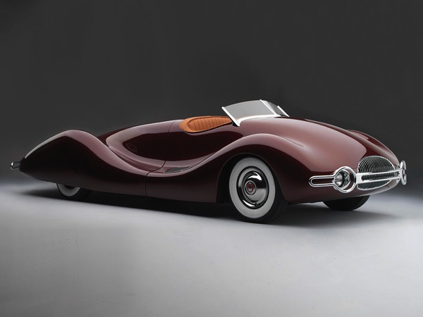
In 1948, Buick presented us with the Streamliner, and streamlined it was. In fact, it looks like it would be far more at home in water than on the land. It’s still a magnificently beautiful car from some angles. From other angles though, the streamliner was a bit…too much.
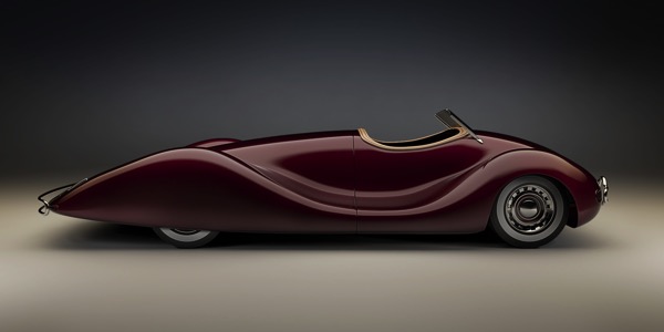
Would you like a little car to go with your trunk? There’s a lot of stuff hanging out behind the 2-seater cockpit. The streamliner was the best kind of car, a mid-engined car, with the motor mounted just in front of the rear axle. and a spare tire behind the motor. The entire rear half of the body lifted, so you could get at the engine. In those less danger-sensitive times, when most able-bodied young men had spent their youths dodging German or Japanese bullets for four years, the fact that this was an insanely unsafe car never entered anyone’s mind. Who cared if there was no crash protection for anything above your shoulders, and a rollover accident would result in grinding your head into a thin smear of red paste on the highway?
The thing was, it was utterly unlike the tall, chunky cars of the day. It pointed towards a smooth, frictionless future at least as much as it did to the Art Deco styling of the 1930s.
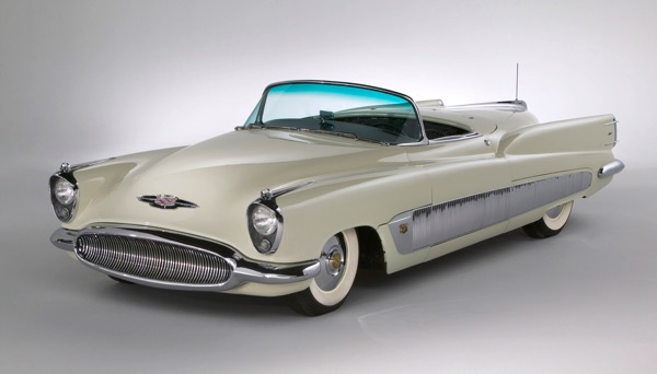
Perhaps the closest a concept car came to showing what the immediate future would look like was the 1951 Buick XP 300 concept. The 1940’s concept aerodynamics are still there, but those headlights and fins would adorn nearly every vehicle made in the US within six years. You take one look, and you know it’s a 1950’s car.
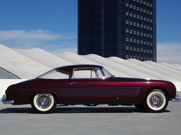
In 1953, car manufacturers in the US were still holding it together. This 1953 Cadillac Ghia Coupe looked modern, restrained, and a bit ahead of its time. I see a lot of Mercedes 280 SL in that concept, though the side strakes have a bit too much of a “37 pieces of flair” vibe about them. But, at least for the first part of the 1950s, it looked like carmakers were keeping their wits about them.
And then, things went sideways.
By the mid-fifties, Americans went jet crazy. They loved jet airplanes. Loved. Them. Then, rockets came along and they loved them even more.
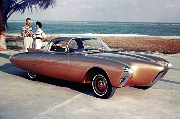
This led directly to the 1956 Oldsmobile Golden Rocket Concept. If the internet had existed in the mid-50s, “Moar rokits!” would’ve been the dominant meme. “We must have nose cones!” the designers cried. “We must have ram-air intakes!” If they would’ve stopped here, that would’ve been fine. But they couldn’t.
Because in 1957, the Russians launched Sputnik, and the country became rocket-mad overnight. Car designers couldn’t avoid the tidal wave of space enthusiasm. And compared to what was coming, the Golden Rocket was an exercise in conservatism and restraint.
“If they want rocket cars,” said the designers at Ford, “we’ll give them rocket cars.”
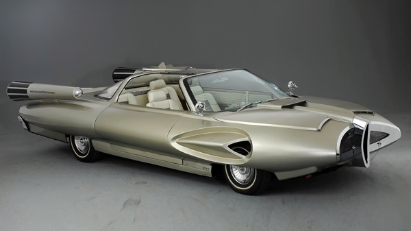
Behold the future that is the 1958 Ford X2000. Literally nothing about this car makes sense. The front grille appears to have been intentionally designed to bisect children. I have no idea how you would change any of the tires, but I’m fairly certain the vents above the front tires aren’t any help. Where are the side windows? What are the side windows? Are they removable, curved pieces of plexiglass? Is there any place to store them in the vehicle? If not, what do you do if you take them off and it rains? If you leave them on, doesn’t the interior become a greenhouse in the sun, with an ambient temperature high enough to melt lead?
Then there are the faux rocket packs on the rear fenders. I look at them and I can’t even. I mean, I simply cannot deal.
But that’s not what the engineers at GM thought. They didn’t think that, at all. No, they thought, “Those retards at Ford can’t make a rocket car. At GM, we know how to make a rocket car!”
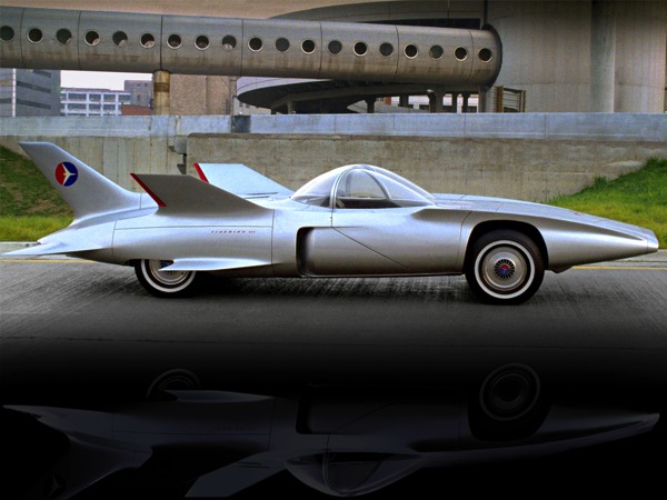
Which brought us the 1959 GM Firebird III. Screw Ford, and their practical four seats, with their simple child-slicing grille. This baby was set up to ensure that any pedestrian within three feet of the vehicle would be neatly sliced into at least five pieces by the totally unnecessary wings. And you can forget about removing the plexiglass for occasional comfort when the weather was right. You’ll sit in this glass-enclosed hot box and like it, damn you. And you want jet power? Well this baby’s got it, with a 28,000 RPM turbine engine, not one of those old-fashioned piston-driven jobs. In addition, it had another, separate 10 HP motor, just to run the accessories. You know that lawnmower you use every weekend? It has a 3 HP motor. The Firebird III needed more than three times that amount of power to run the electrics. Though, of course, this was the 60’s, so most of that power went to the cigarette lighter.
Now, you may be initially attracted to the idea of a fast-looking, jet-powered roadster. You will probably be less attracted, however, once you learn that this roadster’s jet engine only put out 225 HP, and it weighed…wait for it…5,275 lbs. This combination produced a 0-60 time measured in geologic ages. Only in 1950s America could you build a roadster that weighed two and a half tons.
It also had a joystick instead of a steering wheel, because no one needs to transfer familiar driving skills to a new vehicle, ever.
Keep in mind that this was the Firebird III, which should tell you that there were two previous, even more impractical and unworkable Firebird concepts. This, surprisingly, represents the full maturity of the Firebird concept, as difficult as that may be to believe.
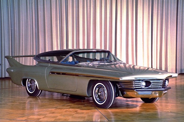
By 1961, designers began to back away from that particular ledge, producing the Chrysler Turboflight concept. In comparison to the Firebird III, this is a concept car that looks practically normal. Indeed, it was the beginning of a move back towards more practical concepts that actually might be seen in future production.
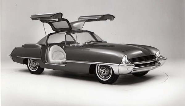
The very next year—perhaps embarrassed at being so completely outdone by GM in producing wildly impractical rocket cars—Ford led the move back to normality with the 1962 Ford Cougar 406. Clearly, this was still a car of the future, because gull-wing. Other than that, it looks very much like a tarted-up Thunderbird, though with much lower seat backs, to ensure that a rear-end collision would produce instant whiplash.
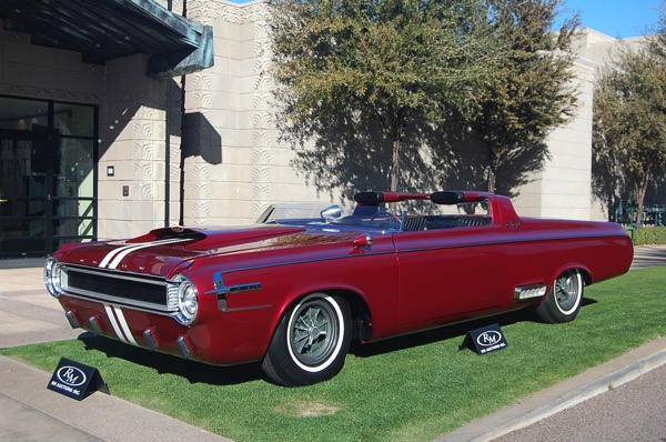
Meanwhile, over at Mopar, they were working on muscle cars, and produced the 1964 Dodge Charger Hemi. Unlike the Cougar 406, the Charger did have headrests, though they were mounted on the wing behind the coupe’s cockpit, mainly because the designers really didn’t want to give up on winged cars, though they did want to reduce the incidence of pedestrian bifurcation.
Among the innovative design features of the Charger concept was a center console that ran between the bucket seats. Now, perhaps you’re saying to yourself, “But, wait, many cars have always had a center console.”
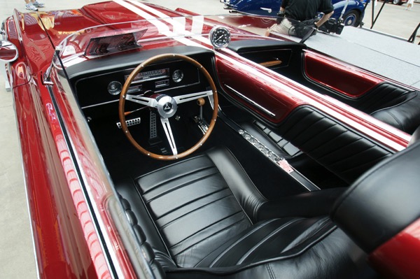
Not one that came up to your chin, so the racing stripes could be continued all the way down the body, they didn’t. The key benefit of this, aside from the cool paint job, was that it ensured that in any side collision, you would bash your brains out on the head-high metal bar running through the cockpit, thereby avoiding large hospital bills.
After seeing this, the thinking at Ford was that muscle cars were going to be the Next Big Thing. “But,” they thought, “What the muscle car buyer really wants is practicality.”
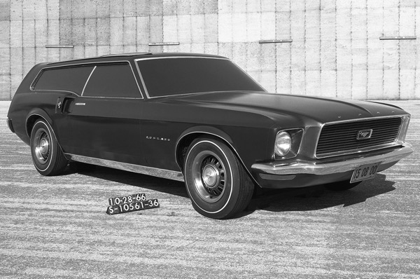
That sort of thinking led to the 1966 Ford Mustang Station Wagon design study. The funny thing is…they were right. There’s a reason people love the AMG-powered Mercedes shooting brakes. We could’ve had a Mustang shooting brake in 1967, and Ford totally dropped the ball on it. And why shouldn’t a station wagon have 500 HP?
Don’t bother answering that. It’s a rhetorical question. There is of course, absolutely no reason.
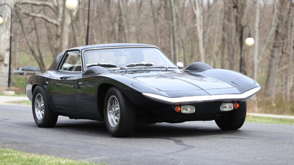
Meanwhile, that same year, GM was looking to sex up the Corsair a little bit, and they came up with the 1966 Corsair Fitch Phoenix concept. And thus, the wedge was born. Though this body style eventually migrated to the Corvette in substantially this form, everyone else in the world saw the wedge…and fell totally, completely, in love with it. The wedge. The wedge was the future!
And car designers ran with it. Everywhere.
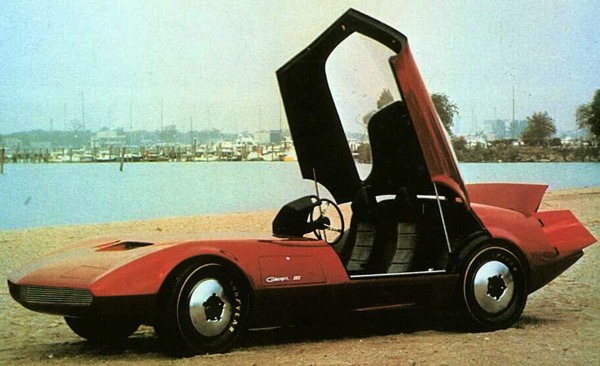
The 1968 Dodge Charger III was even wedgier. Plus it had a canopy roof over the cockpit! The wedge was coming into its own, and it was unstoppable.
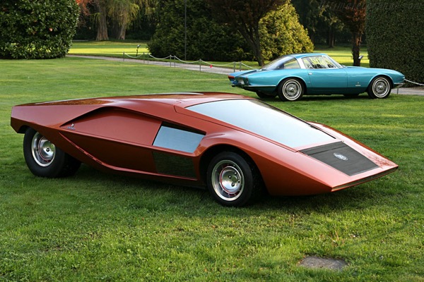
By 1970, wedges began to hit the apex of design as the Italians started designing them. This is the 1970 Lancia Stratos Zero Concept, designed by Lancia and Bertone. It was the wedgiest wedge that had ever been made. Two years later, Lancia and Bertone produced a less wedgy production vehicle based on the concept, named the Lancia Stratos, but with different mechanicals.
In addition to having a somewhat less futuristic, but still wildly impractical wedgy design, the Lancia Stratos was champion rally car, as well as a car that actively tried to murder you. Often, you would enter a corner at speed and it would grip and go like the dickens. But, just when you least expected it, it would go wildly out of control and try to run you into a stand of trees. If, by some slight chance, it didn’t kill you during a drive, you would wake up at night to see it looming over your bed, breathing heavily, holding a kitchen knife.
Of course, once the Italians endorsed the wedge the game was afoot. Everyone built wedges. All over the world, the wedge became the new standard for concept car design. It was as if every car designer in the world was channeling the spirit of the 11th Doctor. “It’s a wedge. I design wedges now. Wedges are cool.”
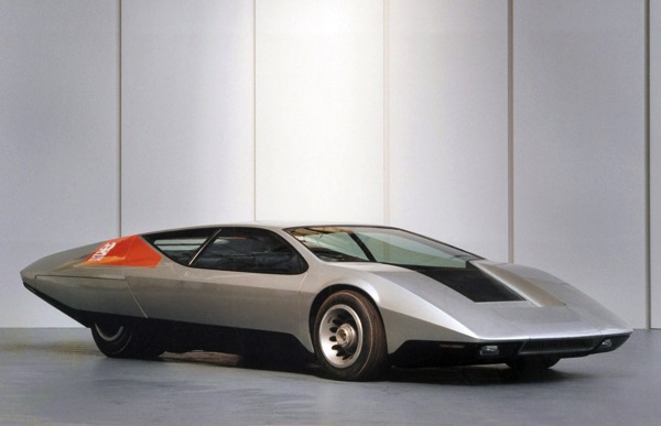
The Brits tried their hand with the 1970 Vauxhall SRV Concept.
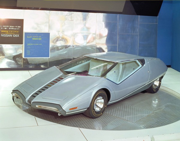
The Japanese effort was the 1971 Nissan 126x. There were others, too, from Mercedes in Germany and Citroen in France. But nobody, and I mean nobody, could top the Italians.
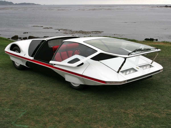
The Pininfarina Ferrari 512S Modulo was the very apex of strange, impractical wedge design.
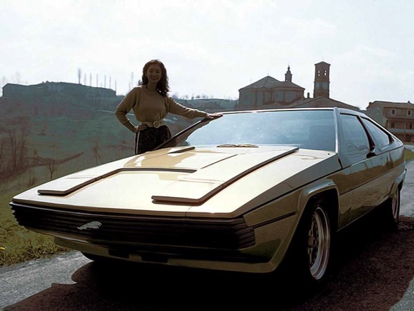
Perhaps the saddest wedge was the 1977 Jaguar Ascot Concept, built on the 12-cylinder XJR platform. Unfortunately, it was a 1970s Jaguar, built by people who, when they weren’t on strike, were lazy British communists. You can tell it’s a 1970s Jaguar because not a single body panel on the concept fits correctly.
By that time, though, rising oil prices, and a general worldwide malaise brought on by the Carter Administration, were in full swing, and the wedge’s days were numbered. Indeed, throughout the civilized world, there was an odd sense of purposelessness when it came to cars. What was point, really, if, instead of wedges, all the future held was Communist triumph, followed by tiny, economical prole-boxes?
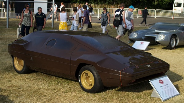
The Italians gave it one last try with the 1978 Bertone Lancia Sibilo, but it was…well…a mess. It was a transitional car between the wedges of the 70s, and the more blocky cars of the 1980s. Still, it was quite mad.
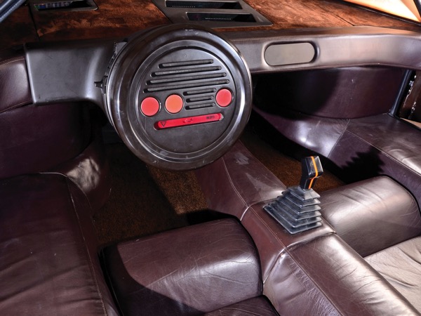
Not only was it colored, inside and out, the exact shade of feces, it was also incomprehensible. All of the gauges are tiny LED readouts scattered randomly on the dashboard. There are large buttons on the wheel whose purpose is not evident. What’s the shift pattern to change gears? I dunno. Your guess is as good as mine, because nothing on the gearshift knob indicates how it works, or what gear is which. You can’t even rest your hands on the inside of the steering wheel, because there is no inside. It’s just…a disk. And forget about going to the drive-through at McDonalds, because you can’t get anything through the tiny portholes in the side.
It’s a mess, just like the end of the 70s was. With it, the whole 30-year era of insane, futuristic car design simply faded away.
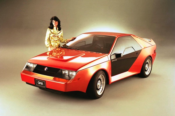
The 70s ended, and what we were left with were designs like this 1980 Mustang RSX Concept. The wedge mutated, and turned blocky. And concept cars no longer looked like the future.
I still go to car shows, and I still look at concept cars. Many of them I like, and would like to see put into production. But I still remember how it used to be. How all those concept cars were made into Matchbox and Hot Wheels toys. How I used to play with them and dream of an immaculate wedge-shaped future.
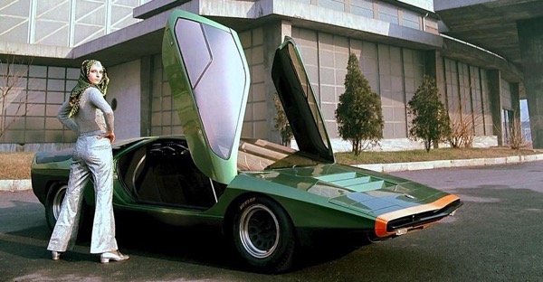
For a brief time, this was the future. We would dress in our skin-tight, gold and silver lame, close the gull-wings, and drive our wedges to McDonalds to pick up our Big Mac food pills.
I miss that future.